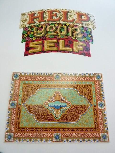
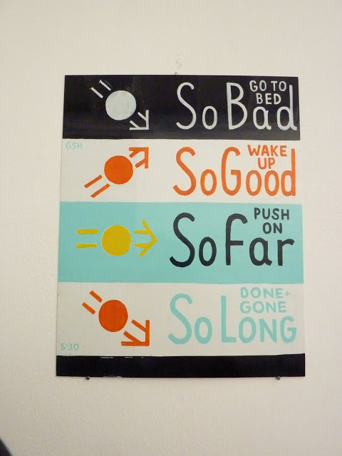
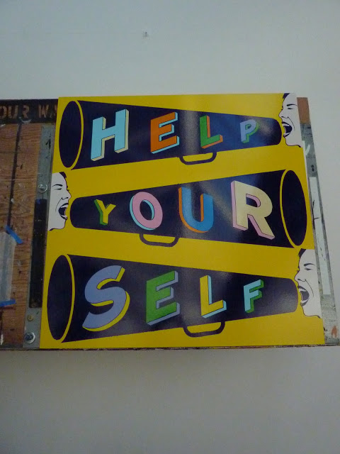
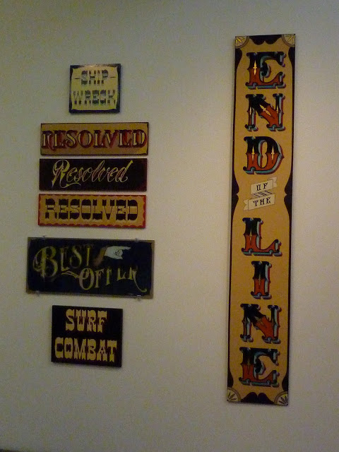
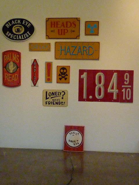
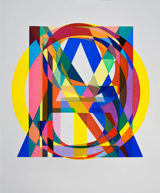
I've been thinking a lot about lettering lately. I am currently working on an illustrated alphabet series with a little bit of letters here a little bit of snarky animals there. I'm currently working on getting the animals just right but what about the alphabet itself? I've never really done a alphabet before. There is so many lettering inspirations around me everyday (I'm married to a
sign painter, so I'm not kidding here). So my question is, where will I go with this? Simple or super detailed? Quiet or loud? Huge or very, very tiny...I'm not sure yet but I've been having fun doing my research.
Here are some of the type artists that are turning me on right now:
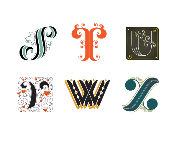
Here is a few from Jessica Hische. I really love wonderfully illustrated type, she is such an inspiration for me...Check out here
website for much more.
 |
| Buttermilk Font by Jessica Hische |
 |
| Mother Nature Daddy by Jessica Hische |
 |
| Amazing Alphabet by Jessica Hische |
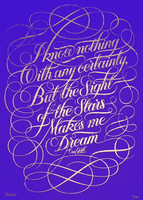
I love Seb Lester's work too. His lettering has such movement and style. There is so much beauty in each of his swirls...Check out more on his
website.
 |
| London Rocks by Seb Lester |
 |
| Keep it Simple by Seb Lester |
 |
| Stars by Seb Lester |
Here is a few from Tauba Auerbach. I love her work, it seems almost alive, like it's still growing and organic. It is amazing that it is all hand drawn. Wanna see more? Check out her
website. I will note that she started out as a sign painter for my husbands shop and it has been amazing watching her career grow. If you ever get the opportunity to look at her work up close, do it. It will amaze you.
 |
| The Letter F by Tauba Auerbach |
 |
| Yes and No and or Yes and No by Tauba Auerbach |
 |
| The letter I by Tauba Auerbach |
What are you favorite artists that work with typography? What do you love about them? Do think they get enough respect in the art world or are they still considered
just designers? Any thoughts?
